The legacy brand felt dated, with no unified system for typography, color, or layout across digital and print
touchpoints
Social media was active but inconsistent, irregular posting, variable tone, and non-adherent brand colors
weakened recognition and recall.
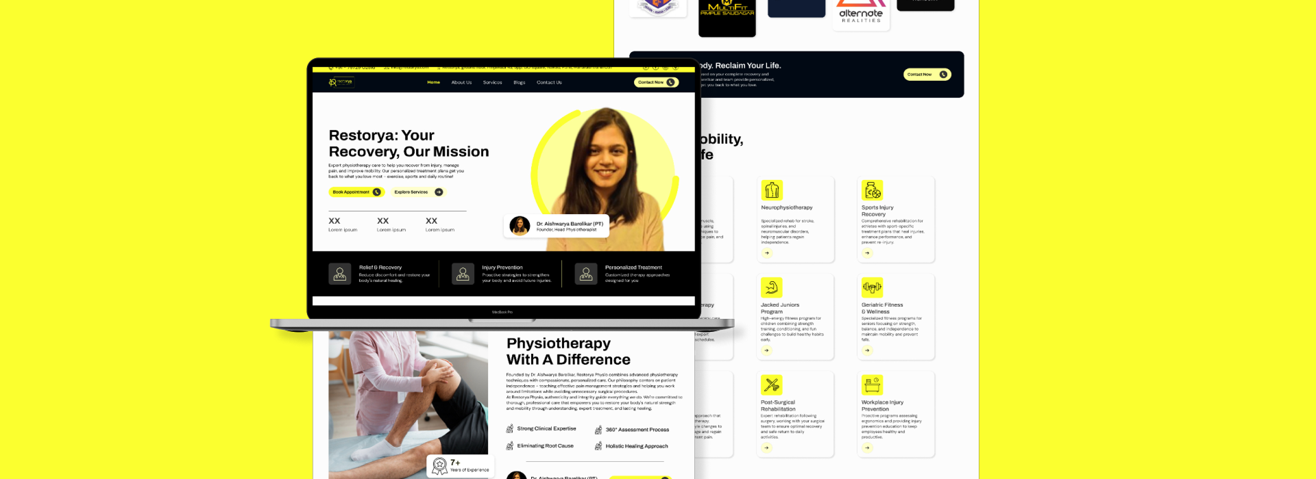
The website needed a full SEO-friendly rebuild: clearer information architecture, treatment pages, FAQs, and
trust elements to aid discovery and conversion.
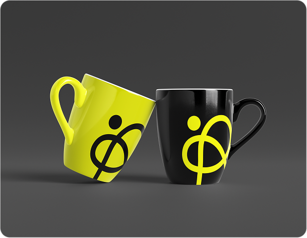
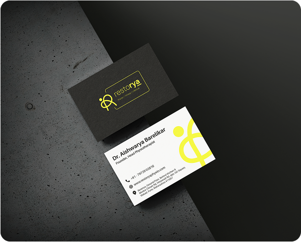
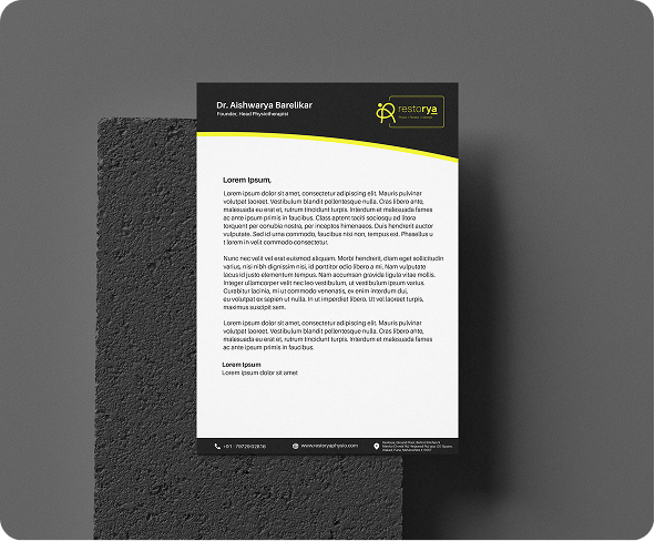
We ran a rapid brand audit, then created a refreshed identity: modern logo, fresh color palette,
typography, and a concise brand book for consistency.
Branding materials followed: visiting cards, letterheads. We also created content pillars, based on which we
made editable social templates for information posts, brand awareness, testimonials, offers, and
announcements.
For the site revamp (WIP), we are reworking on the content to make it customer friendly and SEO optimised.
A cohesive visual system now anchors Restorya’s communications; brand assets are easy to apply across print,
clinic signage, and digital channels.
Social posting is steadier and more coherent, aided by reusable templates, content pillars, and caption
prompts tailored to audience needs.
The new website, currently in development, is structured for search, clarity, and bookings: positioning
Restorya for stronger discoverability and conversions.